
Sanrio is a giant Japanese company, producer and distributor of characters licensed in several industrial segments, better known by the brand Hello Kitty®.
Despite having more than 50 years of performance, the company realized that many of its characters are unknown by the current younger audience. Based on it, they decided to launch a mobile game that brings together the entire universe of Sanrio, with 3D characters and 2D elements.
In this project, the proposal was to create an interface that matches with the artstyle of the characters, scenarios and items of the game, maintaining the typical cuteness and simplicity of Sanrio.
YEAR
2017
TEAM
3D ARTIST
Victor Negreiro
DELIVERABLES
UI Design
Icon Design
2D Illustrations
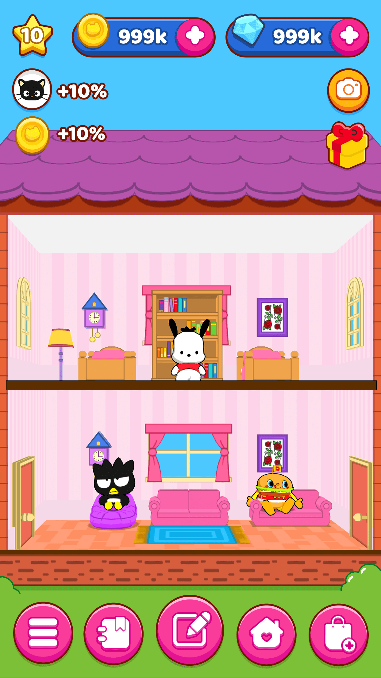
Gameplay -
Main screen
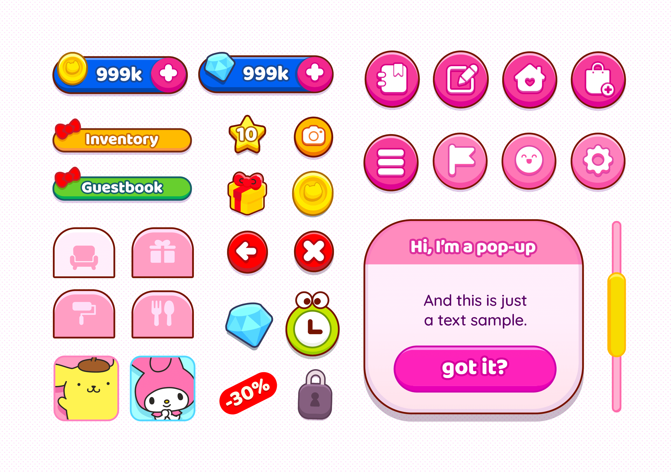
One of my concerns about the HUD it was to create 2D assets that matches the 3D character style of the game: solid colors and chubby, rounded shapes with dry shading and highlights. I also added some "volume" to the buttons and icons to resembles the 3D looks.
Despite all the Sanrio's characters has a black outline, I chose brown as a color for almost all assets, because it gives the user interface a less agressive look.
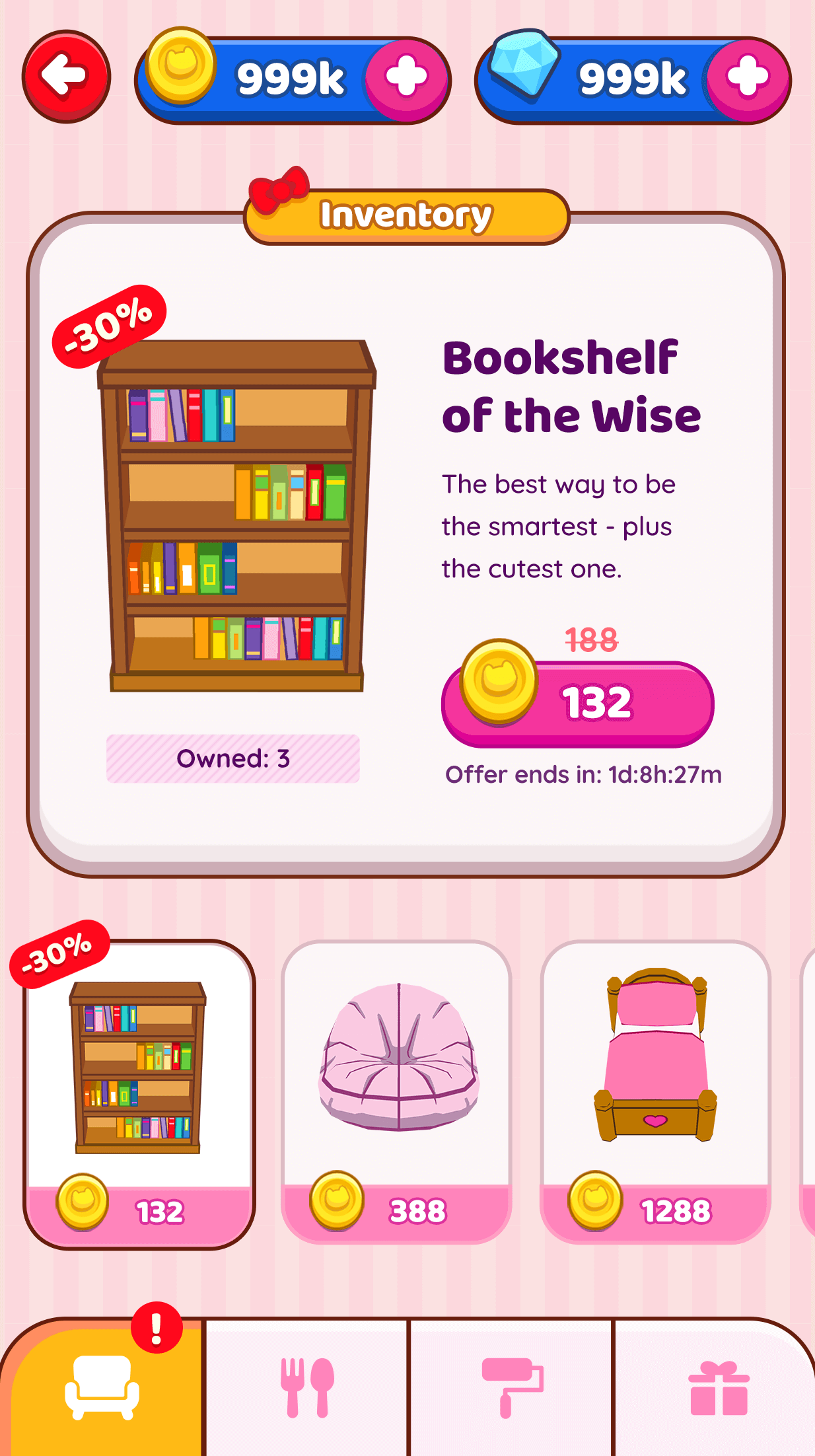
Inventory
One remarkable characteristic of the Hello Kitty art style is its monochromatic color scheme. I thought it would be interesting to maintain this in the internal screens, as the gameplay itself is very colorful and filled with diverse elements.
Additionally, in this section, I designed a different icon style from the main ones with two goals: to visually connect the information to the Inventory and to create a cleaner layout
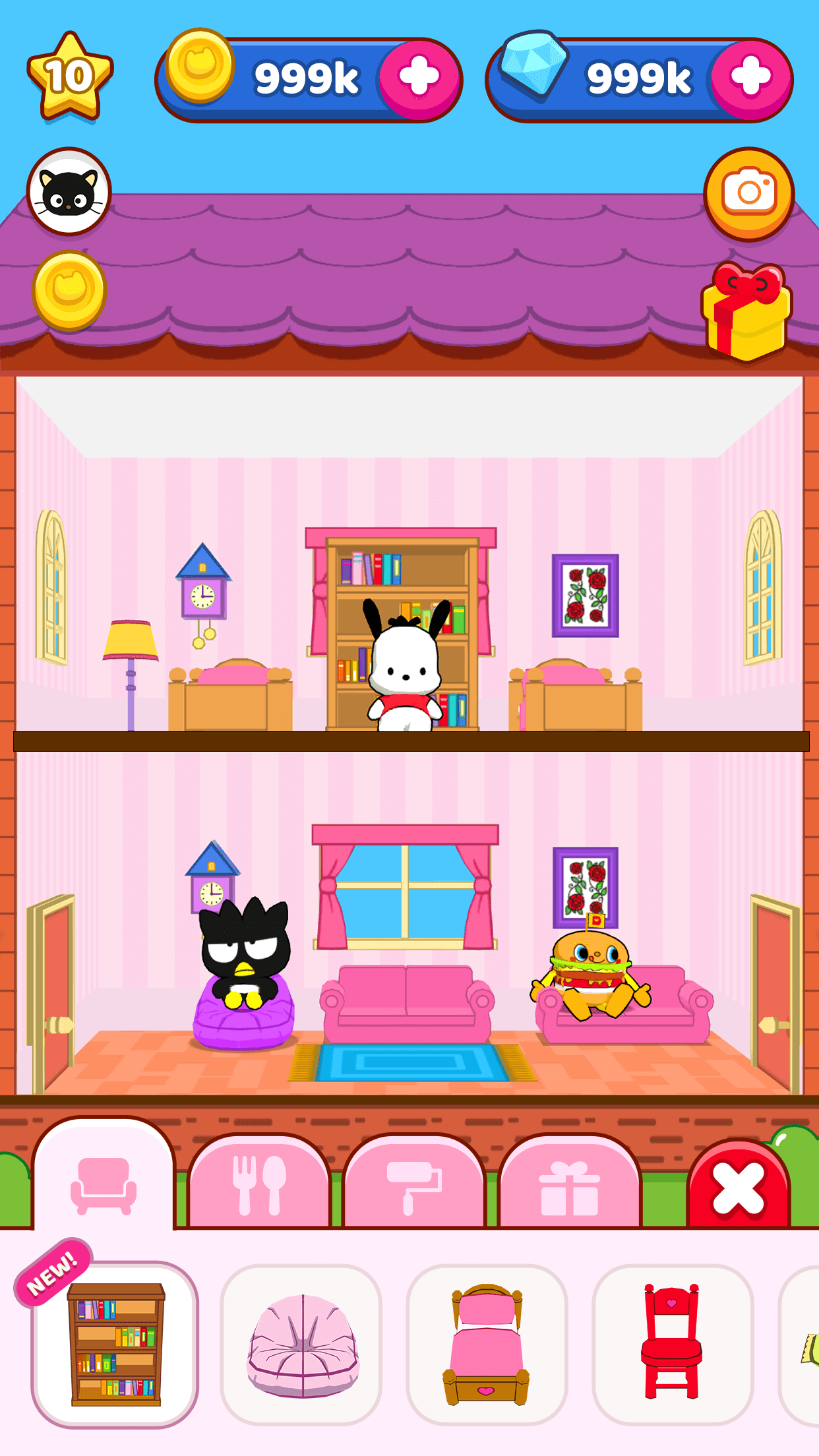
Gameplay - Decoration
In the decorating section, I changed the pattern of the Inventory icons - lighter for the selected option and darker for the inactive - this way I can give it a tab appearance.
Another detail is the close button, which was also designed as a tab. Because of that, all the decision elements will remain in the same horizontal line, considering that it would be easier for players to find the button and exit the section. The close tab has a greater distance between the decorating options - so it may decrease the chances of miss click.
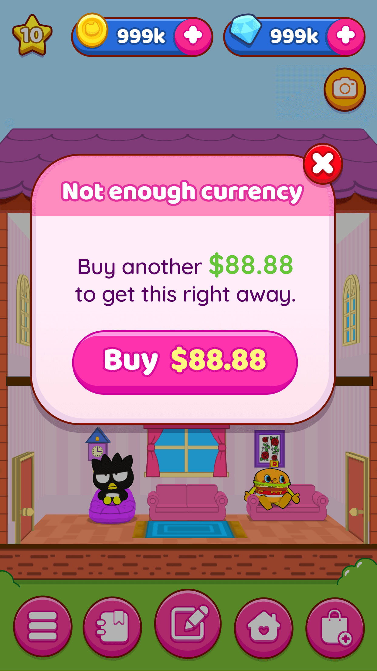
Currency Pop-Up
A simple yet super-cute alert pop-up.
The close button is intentionally smaller than the others, because it's not a primary action we wanted players to take.
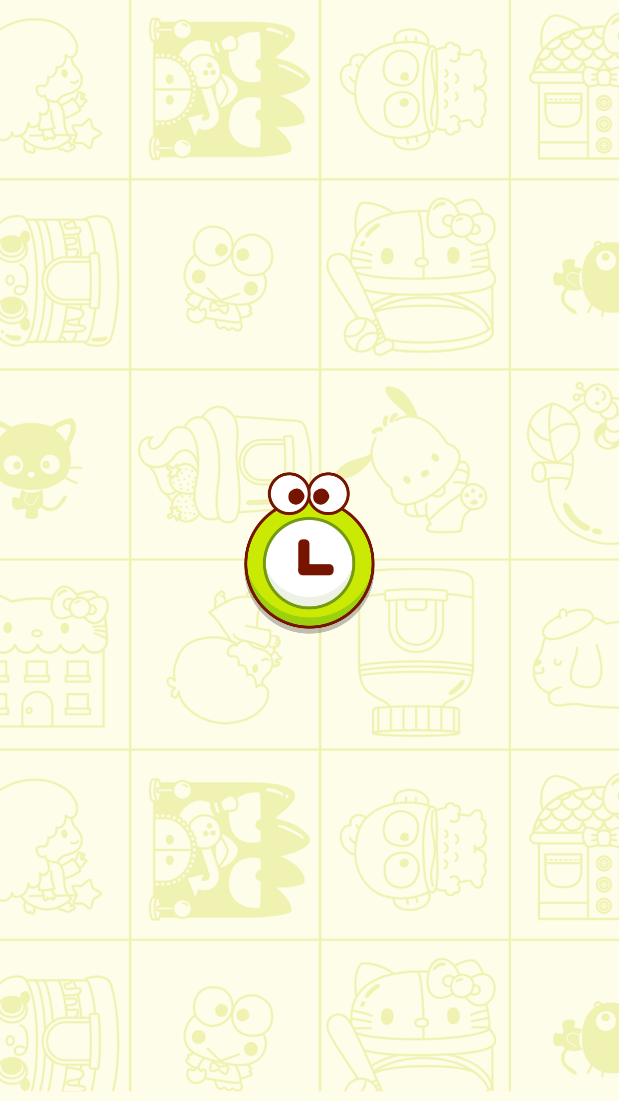
Loading
Many elements of the Sanrio's universe are customized with the characters design. I thought it would be cute and appealing to fans if the loading screen was a watch with Keropi's face.
(I choose Keropi because he is one of the most popular characters of the brand and also because it was easy to adapt the character design to a rounded shape)
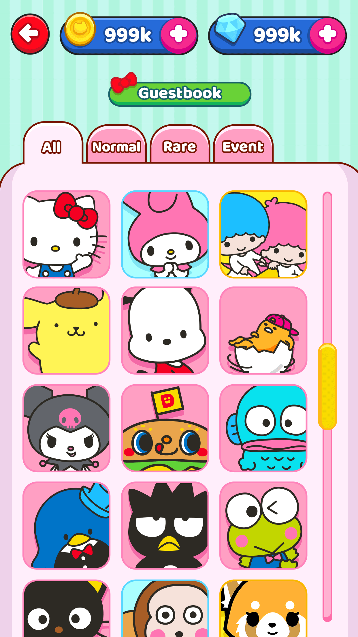
Guestbook I
For this section, I thought it would be fun if the character's picture looked like selfies, so I cropped the images and positioned the characters to give that impression.
The different colors in the background (blue, yellow and pink) are related to each type of the characters: rare, event or normal.
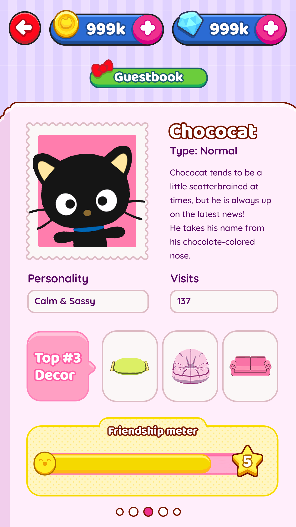
Guestbook II
In the second part of the Guestbook section, the character's information background resembles a notebook page and the picture has a stamp format - related to the concept of travel and hosting.
I also gave a special attention to the Top 3 decor info, since the players can purchase the objects and that's a important gameplay strategy.
Studio Tinymoon® 2025
Thanks for visiting!